Prompt Shoot Composition 2
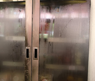
 I decided to use this photo for the COLD prompt because it's a cooler and it just makes sense. I cropped this photo but i think i could have taken the picture a lot better, I tried to crop it to where the handles made the rule of thirds aspect of it, other than that i think this picture is good but not my best.
This picture was used for ELECTRIC because he's holding a camera and its right next to a vending machine, I used rule of thirds for this photo but it's really dark and kind of hard to see, other than that i really like this picture.
My main idea when i took this photo was to try to get anything thats purple, the thing that bothers me the most is the big glare on the glass but it makes it a dark and light picture and i think thats really cool. The picture could have been taken from a different angle so the doesn't appear, other than that this is one of my best photos out of the three.

