Wednesday, September 18, 2019

Photo Manipulation and Ethics

Ryan Zukauskas                                                                                                                           Period 3

Photo Manipulation & Ethics

Some of the main points i read about in the article talked about how the media produces and gives information to the public, It's all about how the media feels and the facts that they say there sharing are actually just there own opinions and how they feel about the situation. With issues like this to weigh along with the countless others, including but not nearly limited to, upper management pressure, rating's pressure, employee pressure how is a manager to deal when it comes to performance. With increasing ease editors, photographers, and just about any joe shmo can open up photoshop and wreak havoc on the ethics of hardworking journalist. Where in the distant past that honor was left up to the highly skilled, extremely patient hands of manipulative, trained photo developers. The Washington Post and New York Times usually only manipulate photo's when there is something that the subject in the picture or who owns the place wants the photo to look not more appealing but just better, and that can be making the subjects teeth whiter or adding in someone to the background or crowd of the picture, but it's only really to make it look appealing or just more suitable for when the photo gets released to the public. I think some things that you could manipulate to a photo that aren't unethical are maybe changing the color of something in the background or, but somethings you should never do are drone photography, trespassing, photos of people of without their permission, copy other photographers, and take pictures and print photo's of money. 


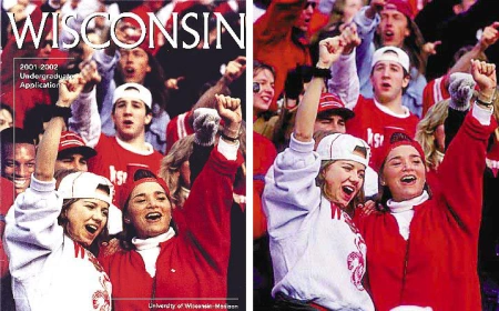
uwmadison12

Personally i think that this is the most unethical photo out all of the of the ones on that website, because the University of Wisconsin realized that the majority of their students are white and it just so happens that the photo was taken with all white students in the frame so i guess the editor decided that it would be okay to photoshop a picture of an African American's head in the frame, The main reason this happened is because the University of Wisconsin asked the editor to do this so their ethnicity percentages would look better because 69.9% of UN is white and about 2.25% is black or African American, This isn't illegal but it's very wrong and once everybody found out that this was a fake it made UN look really bad and i think they deserved that.


couric12

I think this one is the least unethical because all they did is just make her look better and I don't really see how that's a bad thing, The main things that they changed were make her waste look skinnier and her face and cheeks a little bit slimmer, So thats why i think that this photo is the least unethical.


Monday, September 16, 2019

The History of the Camera

Ryan Zukauskas                                                                                                                           9/16/19 

The Camera

1.The first permanent photo was taken by Joseph Nicephore Niepce in France, 1826

2. A heavily polished sheet of silver plated copper.

3. Ansel is famously known for her landscape geography pictures.

4. You need to know shutter speed, aperture, and ISO.

5. The three metering modes are matrix metering, center weighted metering, and spot metering.

6. You would center weighted metering when you want the camera to prioritize the middle of the frame.

7. It says another great example of using spot metering would be when you want to take photograph's of the moon.

8. The four camera modes are program, shutter priority, aperture priority, and manual.

9. In shutter priority you manually set the camera's shutter speed and the camera automatically picks the right aperture for you while in aperture priority mode you manually set the lens aperture, while the camera automatically picks the right shutter speed to properly expose the image.

10. Manual focus allows to photographer to personally set and focus the camera, while autofocus lets you just press a button before your about to take the photo and focus's and sets the camera very quickly.

11. Personally i think autofocus is better than doing it manually because its a lot faster and with the click of a button your camera is in focus and your ready to take a photo of your object.

12. Some of the best places and times to use flash while indoor is when your shooting at a wedding ballroom, church, and reception areas because they are prone to have less ideal light.

13. The only time when you should use flash outside is when its dark or your trying to fill the flash because the subject is poorly lit.

14. You would use a tripod so your video wont look shaky or unprofessional, and a tripod can be anything as long as its still and stable.

15. Yes, you should use auto focus because when your taking a video and you turn the camera to another object you want the subject to be in focus.

16. A good ratio to shoot is 50% close up's and extreme close up's, 25% medium shots and 25% wide shots.

17. Most modern digital cameras have four histograms, the primary one is luminosity that shows overall brightness of a scene.

18. A low key histogram you can see the "weight" of the histogram on the left side of the graph and it tapers rapidly as you move towards the center.

19. A high key image you can actually see all the data in the graph is off to the right of the histogram.

20. A clipping represents the loss of data from that region of the image. Digital cameras are known for their ability to extract detail from a dark shadow regions of an image.




Wednesday, September 11, 2019

Peer Reflection

https://nathansphotojournalismblog.blogspot.com/


Nathan used the perfect photo for rule of lines and the prompt was square. I really liked the way the photo was taken at an almost sideway's angle and everything in his pictures just fits and goes together really well.

If there was anything that needed improvement it would be the lighting in his happy prompt picture other than that all of the photo's were all really well taken and they look really well done. 


Post shoot reflection

Ryan Zukauskas                                                                                                                   9/11/19


Post Shoot Reflection 

1. Some of the challenges i came across were that the wind was really strong and when I was taking both photo's of the girl the wind kept blowing the other way and she had to keep fixing it, I also had trouble getting the perfect shot for the Bowie Oak picture because i wasn't able to get directly under the tree.
2. The technical aspect i found myself thinking about the most was the rusty chain photo because from the start i knew exactly what i wanted to do for metal.
3. If i could completely retake my pictures i would try to get a better square photo and maybe try a different angle on the Bowie Oak picture.
4. Pictures that i would keep that same are the happy and lines photo and the chain and simplicity picture, especially the chain photo because i really like the way i have it right now.
5. The prompt's were fun and all but i would like to change it up next time, the only prompt i would repeat is the metal picture because you can do do much with metal and there is so much of it around us and if you really get the picture and angle the prompt will always stay fresh.

Prompt shoot #1

Ryan Zukauskas                                                                                                                    9/11/19
                                                             Metal and Simplicity 


I decided to use the metal chain for the metal prompt and it just seemed really fitting for simplicity because the rusty metal and my hand are really focused in and the background where the shadow and light and because it's so focused the lines on my hand and the chain really pop.

                                                                   Happy and Lines       


I used this photo for happy because she's laughing and that's what i really focused on because i wanted to capture the moment of her laughing, this picture also worked out really well for lines because of the stairs in the background, they might be blurry but the staircase leads to the girl.

                                                            Square and Rule of Thirds


The main reason i used this photo for square and rule of thirds is because the rectangle she's walking on toward's the camera are split up and you can actually see the lines that make up the squares in the picture, there is a lot going on in the background but it also seemed like the best picture for rule of thirds because the girl is on the left side of the lines and i think it works out really well.


                                                            Balance and Bowie


All of the tree branches in the picture give it the perfect amount of balance, almost all of the triangles are uneven but that's what i think makes the picture so cool, and also because the photo was taken under the tree instead of being far away. This is also Bowie Oak and its the schools tree and i really think that i represents Bowie really well.